
- Year
- 2014 - 2021
- Client
- Crop Trust
- Services
- Branding
- Websites
- Apps
- Link
- croptrust.org
Crop Trust
Did you know that since 1900, we’ve lost more than 70% of the crop varieties that were available on earth? Did you also know that preserving this biodiversity is absolutely imperative if we are to survive climate change? We did not.
At least until the Crop Trust contacted us.
Biodiversity for the common good.
The Global Crop Diversity Trust (Crop Trust) was established in October 2004 by the Food and Agriculture Organization of the United Nations (FAO) and Bioversity International on behalf of CGIAR.
The purpose of the Crop Trust is to build and finance a sustainable, global network of genebanks around the world dedicated to conserving crop diversity and making it available for use globally, forever, for the benefit of everyone.
The Crop Trust vision is highly ambitious. To build a truly self-sufficient network, they needs to raise more than $850 million and convince most of the governments around the world to be part of the project.
This means considerable work and effort in order to raise awareness about its cause, and that’s exactly why they got in touch with us in 2014.
The initial request was to overhaul their branding and website but our collaboration went far beyond that.
From 214 to 2021, we collaborate with them on every possible touchpoint of their customer journey: from branding, to annual reports, campaigns to opendata platforms and motion designs.
In 2021, the Crop Trust has raised more USD 339 million and is considered as the most prominent actor for biodiversity.
A strong identity
Our first mission was to challenge the branding of the organization to better reflect its vision and ambitions.
RESEARCH
The Crop Trust is a global organisation active in more than 100 countries around the world. Our first step was to go back to the roots of the Crop Trust mission and values to identify universal patterns we could use in our work: crops, agriculture landscape, cultural drawings, etc.
GRID SYSTEM
Quickly, we set out the main visual foundation of the new Crop Trust branding : crops… expressed as triangles. That simple shape, combined with a universal set of color tones and an isometric grid system opened a completely new range of possibilities to draw complex, yet universal branding elements.
CONSTRUCTION
The next step consisted in using the grid system and the visual framework to build a logo that would successfully communicate the nature and mission of the Crop Trust: Safeguarding the world crop diversity for the common good.
The reaction of the Management Board of the Crop Trust? “You’ve got it! This is Crop Trust!”.
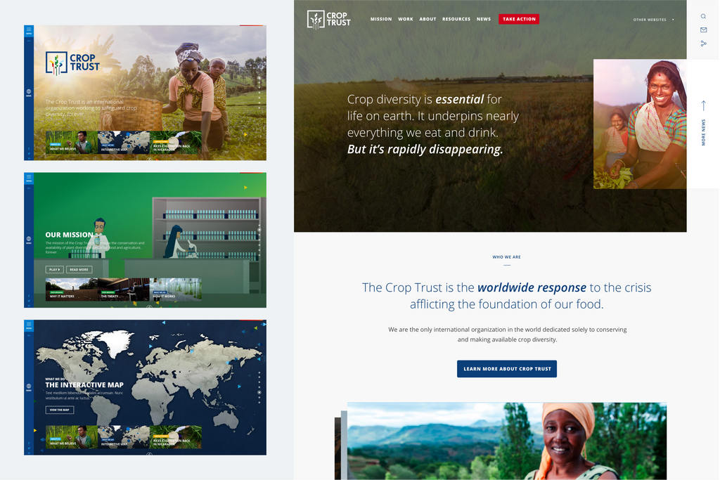
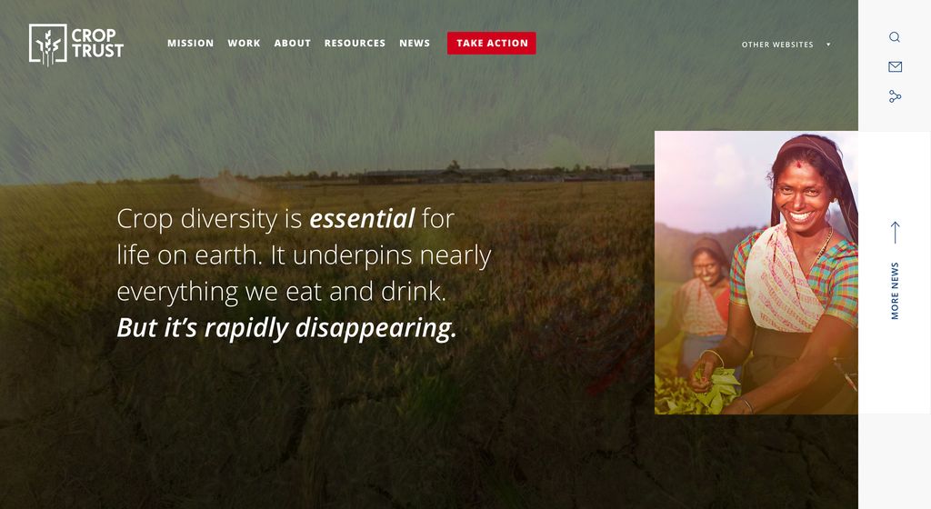
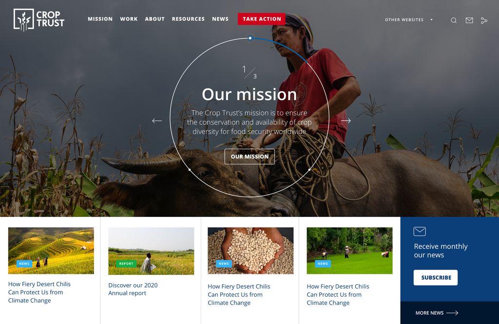
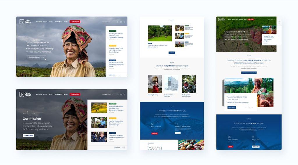
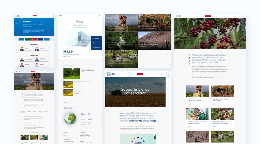
More than a website
Even if, throughout the 8 years of collaboration, we had the chance to activate or overhaul all their digital touchpoints, the Crop Trust’s main website remains the one where the biggest part of our work had been concentrated.
With such a global and diversified audience and a complex story to tell, the website has to fulfil multiple roles from raising awareness to acting as scientific projects database, online media hub and a lot more in between.
In short, how do you engage users with highly different expectations?
Our solution to content structure was to organize it into three layers: inspire, educate, engage. These covered the most simple, visionary messages right through to the more complex, technical or science-related content.
The first layer was created to inspire the user about the Crop Trust’s major vision. The second one was meant to educate the user about the concrete actions and projects. Finally, the third layer was designed to hold relevant content to trigger action for the different audiences : Scientific articles, government toolkit, donation form, etc.
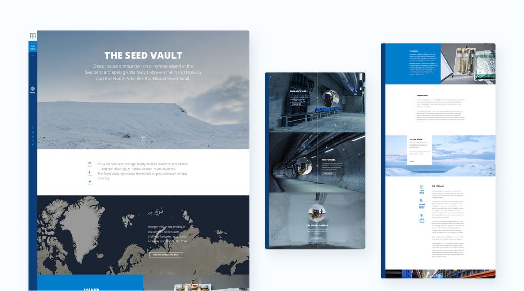
Far, far away in the North
Welcome to Svalbard!
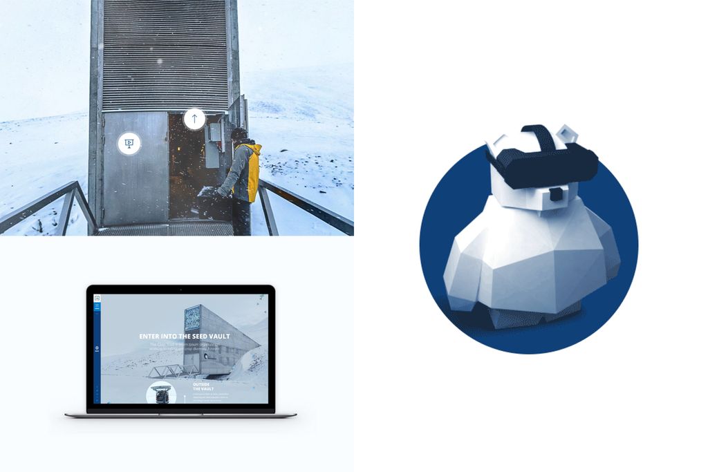
Safeguarding food diversity is not a very tangible concept and it’s easier to relate to something you can see or touch. Quickly, we realized that the Svalbard Global Seed Vault was the best physical representation of this abstract concept. It’s a beautiful bunker built on the most northerly and one of the safest points of the earth: The North pole. Also known as “the doomsday bunker”, it acts as the ultimate backup of crops diversity.
Even though there were already hundreds of pictures of the Seed Vault, it was extremely important to have visual
assets that would fit perfectly within the new website design.
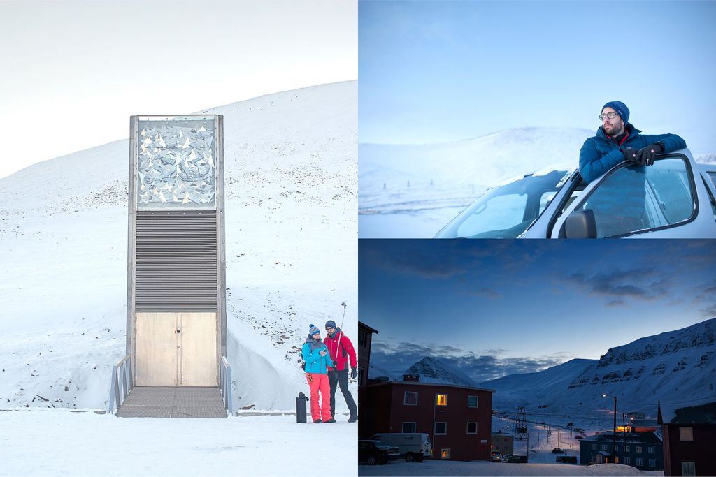
And so you’ve guessed it – in late 2014, we packed our warmest jackets and traveled straight to Svalbard to get the pictures and video content we needed. The first interactive visit of the Seed Vault was using Quicktime 360° videos. Then, in 2017, thanks to a generous collaboration between the Crop Trust and Facebook, we had the chance to upgrade the tour to be compliant with WebVR technology.
Baby, it's cold outside...
Visiting one of the most secret and remote places in the world was a really super cool (bad joke…we agree!) experience for us.
However, the biggest challenge was clearly the climate conditions. From capturing the panoramas in the snow storm to dealing with frozen lenses at -25°C… Gosh, that was EPIC!
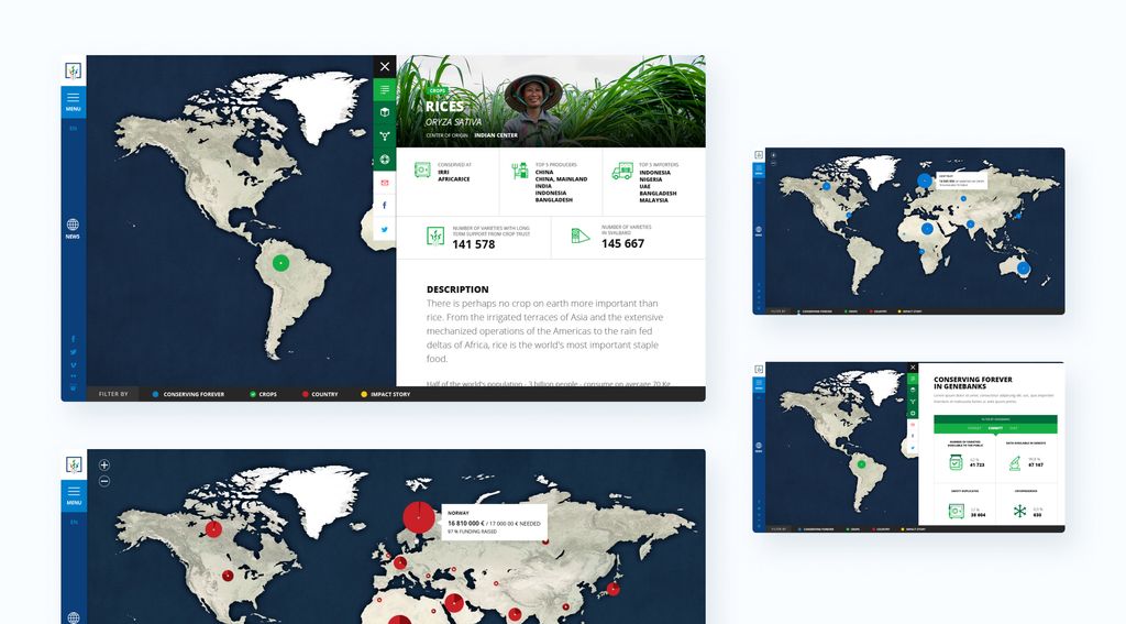
Global Impact, visualised
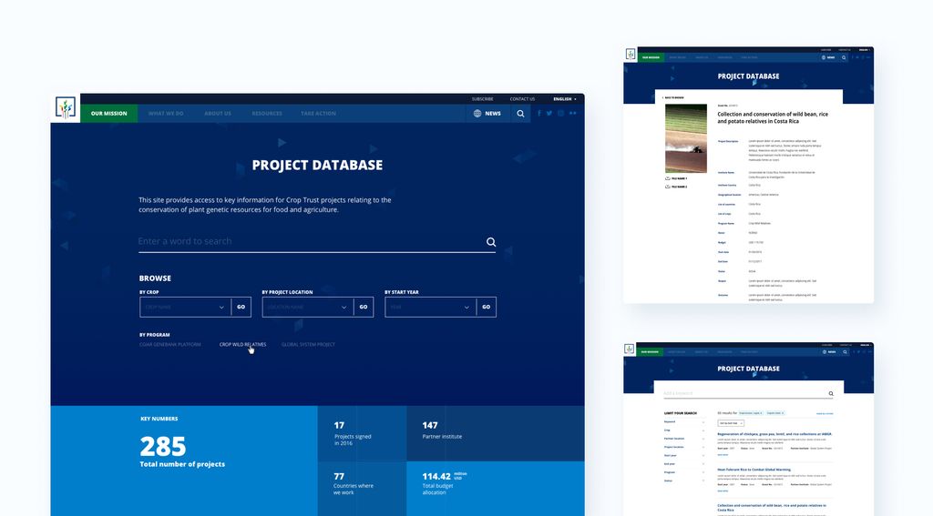
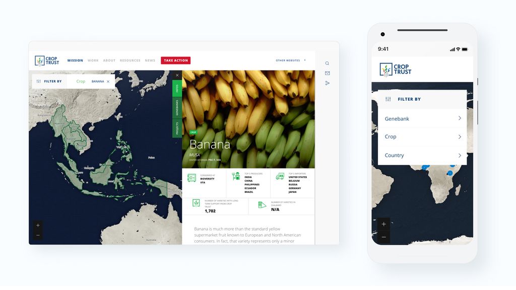
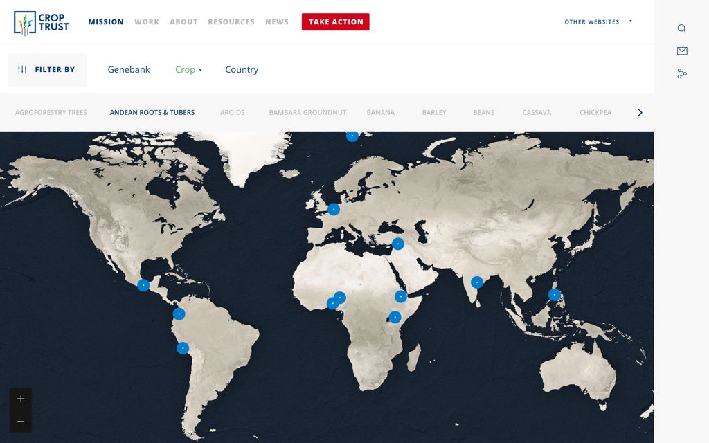
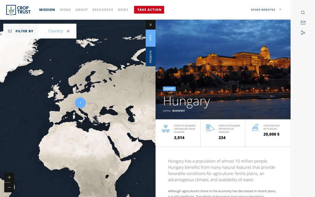
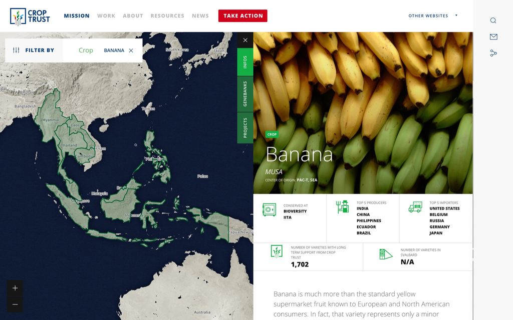
One of the key features of the Crop Trust website is the tailor-made interactive map.
For the public, the purpose of the map was to show the global impact of the work carried out by the Crop Trust. Meanwhile, for the scientists, it’s a convenient tool to find relevant data about a specific crop or country contributions.
In light of the above, it was important to build a dynamic map that could be updated automatically while simultaneously being very easy to use. To achieve this, we used Mapbox map API with SVG ions and data visualizations.
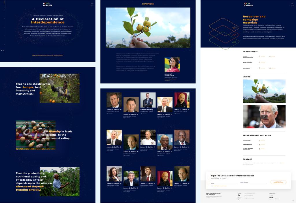
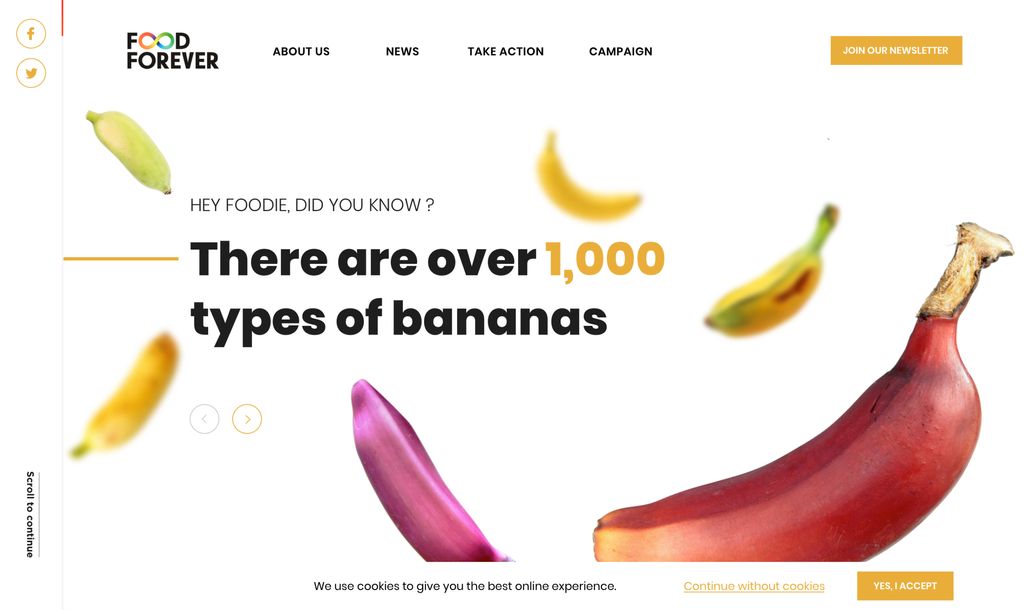
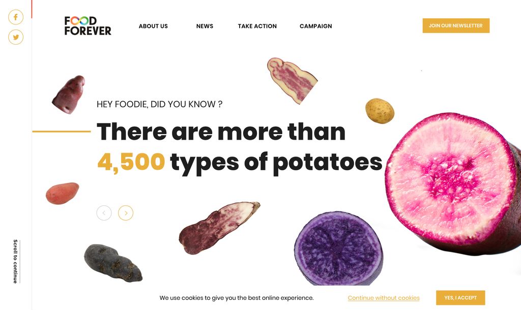
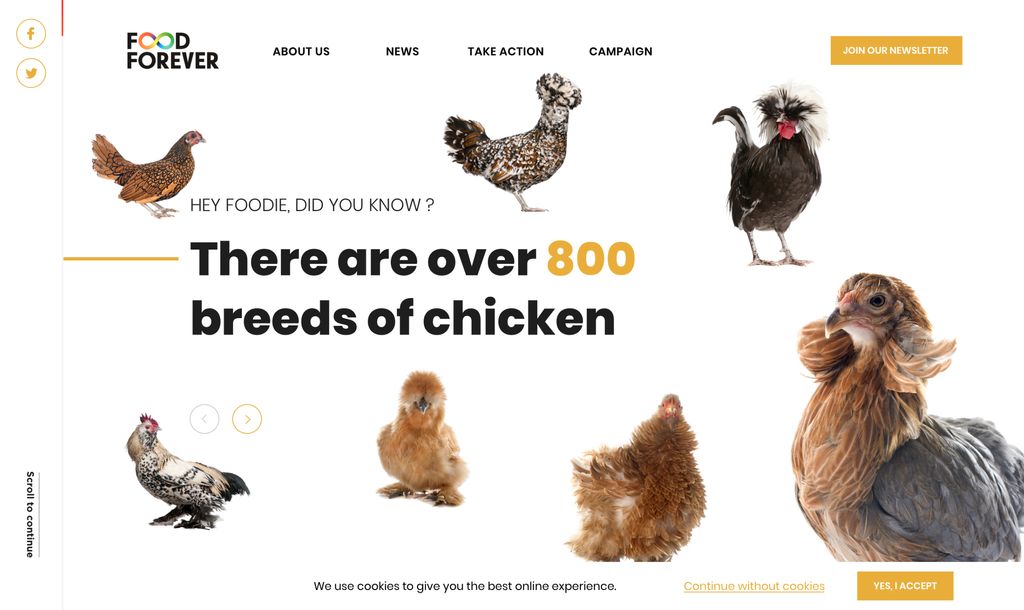
Food Forever campaign
What looks more like a potato than… another potato? We don’t realise it, but there are hundreds, if not thousands, different varieties of potatoes with as many colours and shape. Integrating this diversity in our daily food consumption is one of the key to ensure a more resilient global food system.
Food4ever is a worldwide campaign initiated by the Crop Trust and supported by His Royal Highness King Charles III to recognise and strengthen interdependance between food producers (countries, NGO and private sectors).
Our role was to build the brand identity and the digital media hub to support the campaign.
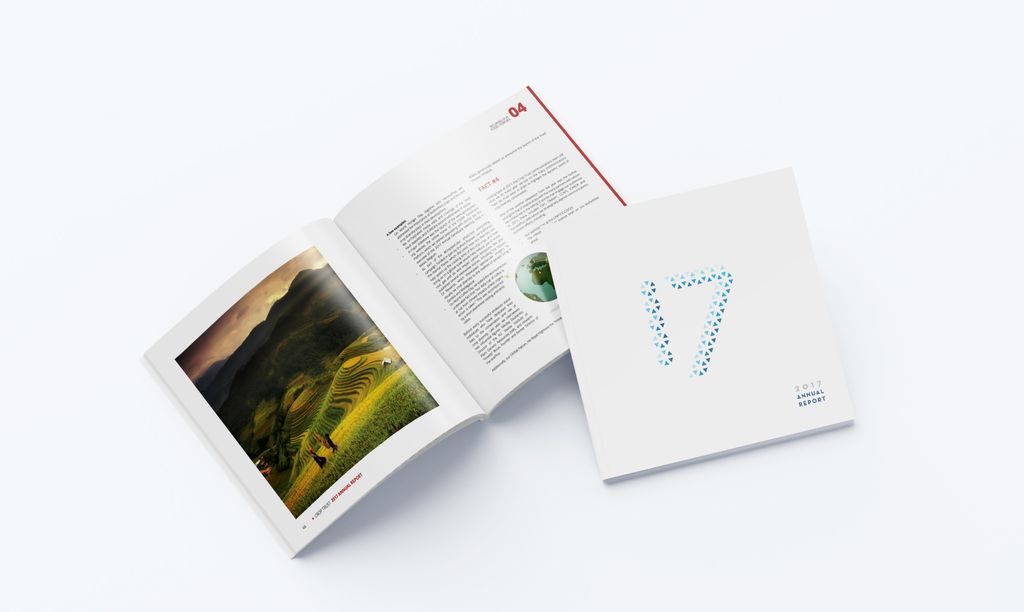
Annual Report
Let’s be frank, annual report is not the sexiest document to design nor the more inspiring to read. Still, for an NGO like the Crop Trust, it’s a key tool to inform about the progress they made and the upcoming challenges.
To ensure that it could be easily shared and spread around the world, and to save as much paper as possible, we decided to build a digital-first annual reports with a printed short summary. In 2014, their annual report even won an Awwwards Site of the day recognition.

8 years, 1 cms, dozens of iterations.
It may looks like a tiny technical detail, but it’s not.
Within the 8 years of our collaboration, the Crop Trust website has been continuously updated and 2 times overhauled… without having to change the CMS (WordPress) or the content. For us, ensuring the longevity and flexibility of an architecture is key to build long-term user engagement.
Today all our projects are using a full headless CMS architecture.