

- Year
- 2023
- Client
- IKO
- Services
- Websites
- Link
- ikorealestate.eu
IKO
The project
While others see ecological and societal challenges, IKO sees opportunities. When it comes to innovative solutions, IKO has made it their life’s mission to come up with the best of the best. This philosophy is embedded into the very heart of the company and must be perceived by its users.
To position them as a benchmark brand in tomorrow’s real estate sector and fortify their brand identity, we helped them redesign their website. After all, a powerhouse like IKO deserves a website that serves as an essential tool in their communication with prospects.
Artistic direction
To complement IKO’s aspirations and establish a distinct brand identity, we honed in on three key design elements. Let’s take a look, shall we?
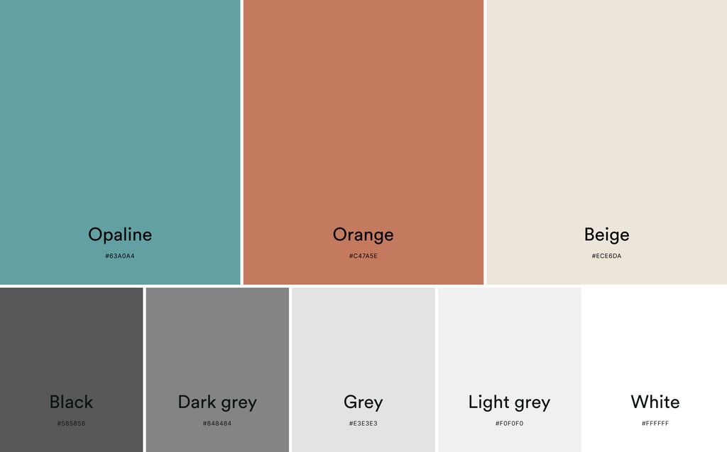
Color palette
In harmony with IKO’s intention to create luminous projects, our design is dominated by white, subtly revealing natural colors such as ochre and earth tones. What better way is there to embody the client’s dedication to eco-consciousness and sustainability?
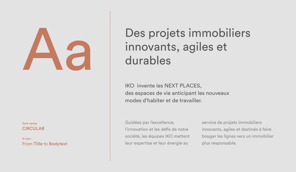
Typography
We chose Circular as the typeface, renowned for its purity and fluidity. It strikes the perfect balance: elegant yet restrained. Moreover, its exceptional legibility makes it suitable for both headlines and paragraphs.
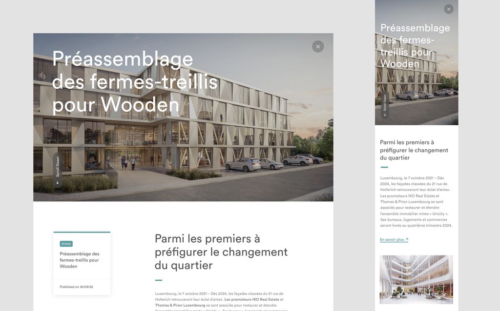
Assets and layout
Sometimes we love a good cliché, and in this case it’s the good ol’ “Less is more”. The design is minimalistic, prioritizing images and allowing those to take center stage. Opting for clear, spacious visuals enables seamless integration of text overlays without the need for additional backgrounds. After all, we want maximal exposure of IKO’s work.
The twist
When we first started working together, IKO’s primary goal was to emphasize their accomplishments by incorporating as much immersive visuals as possible.
As the project progressed, their business strategy continued to evolve. We now needed to integrate a new dimension to the site: the marketing of apartments for some of their residential projects. Cue the showcasing of neighborhoods, buildings, and sales.
IKO commer-cialization
Out with the old, in with the new. To back up the initiative, we’ve whipped up a tool that lets prospective buyers discover the properties in style.
This nifty gadget uses 3D images to navigate through the entire building, right up to a detailed view of an apartment. Curious to see it in action? Check it out!
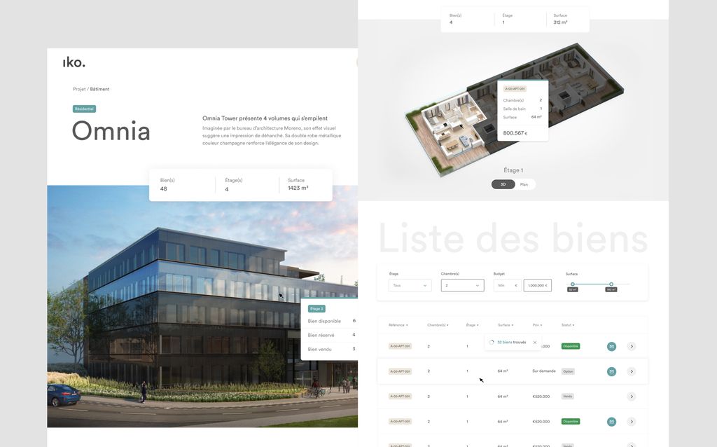
What’s the deal, you ask?
In a 3D projection of the building, we’ve cleverly divided each floor visually, enabling users to seamlessly navigate to their desired area of interest.
Once the user reaches this floor-by-floor view, they can explore the different properties available for sale on detailed floor plans, complete with all the necessary information such as sales status, size, and price. This data, which we get directly from their CRM, stays constantly updated for effortless and transparent management.
From this floor view, the user can then select the property of interest. They get to see a detailed view of the apartment, complete with various images, a 3D tour, and more.
If the user’s interested, they can fill in a contact form. This is linked directly to the CRM and enables the user to enter a conversion funnel. Now it’s up to the sales team to work their magic!
Key figures
The redesign of IKO’s website has strengthened their brand positioning significantly. The enhancements made to user navigation, design elements, interfaces, and essential functionalities are undeniably making an impact. And to back this up, let’s look at some numbers.
- Engagement rate70%70%
- Leads within a year15001500
- Avg session duration+ 63%+ 63%