
Brand Archetypes: the How-to guide

Beyond the logistical challenges, launching an e-commerce store has become trivial, technically speaking.
A Shopify template dressed in your brand colours is enough from a purely functional perspective. But stopping there is completely unforgivable if you take your brand even remotely seriously.
So let’s look at the brands that compete on desirability rather than price. The ones that draw no line between their brand website and their online store. The ones willing to take a stand, offer a perspective on the world, and turn their online store into a cultural vehicle.
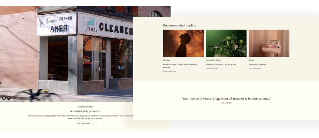
Aesop is an outlier in the skincare world. Very little advertising, even fewer promotions. A firmly premium positioning where price is not a topic. Physical stores designed specifically for each city, and an obsession with a certain kind of literature.
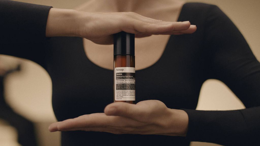
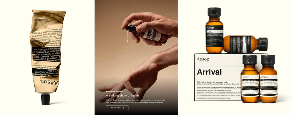
Their online store reflects that philosophy. An art direction executed with surgical precision: crushed tubes, textured surfaces, lighting calculated to the last photon. After all, the challenge is to convey a sensory experience through a flat screen.
Can you feel that tube slowly bending between your fingertips? And that drop of milky cream about to seep into your already clogged pores?
But we’re getting sidetracked. Beyond the technical and artistic excellence, culture is the true vehicle of this shopping experience.
Take a look at the hero section: a video of dancers presenting the products through a choreography that is both minimalist and expressive. The message is clear. If you’re interested in these products, culture is at the heart of your life. And vice versa.
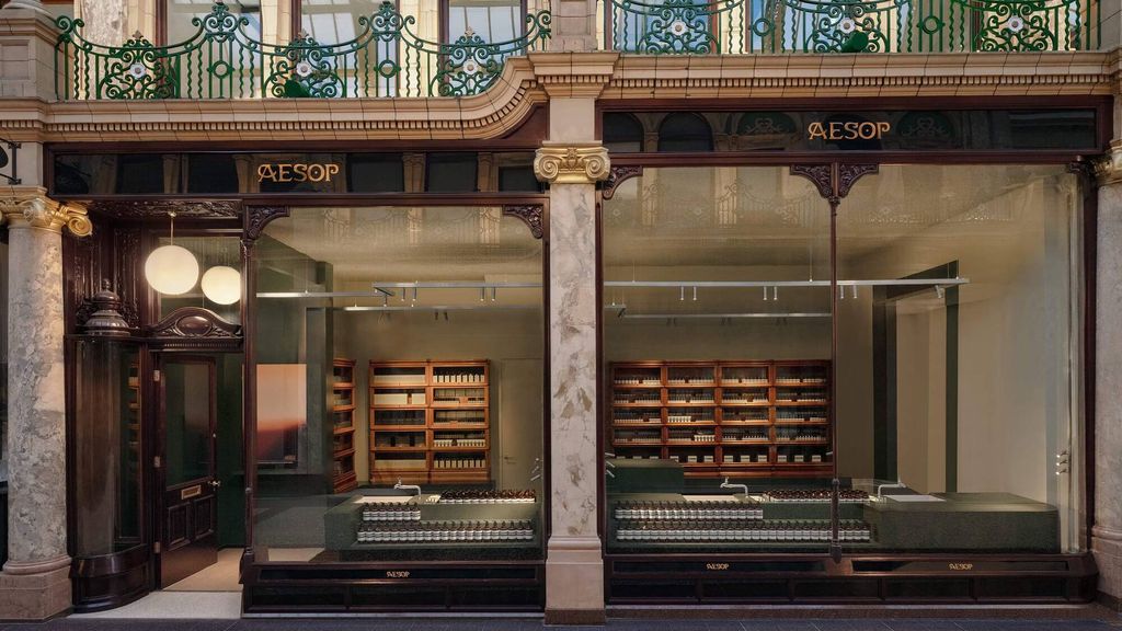
Further down the page, generous space is devoted to the brand’s physical stores, each designed by renowned architects. Aesop isn’t simply inviting people to buy its products; it’s inviting them to buy into its worldview. Cultural difference isn’t treated as a barrier, but as a strength, embodied right down to the retail spaces themselves.
And everywhere, there is literature, authors, and especially women writers from underrepresented backgrounds. References that treat the customer as a reader. The brand purports to speak to people of culture and discernment. Or at the very least, to people with the decency to pretend.
Smell is still the one sense the digital world can’t translate. And until olfactory synthesisers find their way into our devices, brands like Glossier are left selling fragrance online without ever being able to make you experience it.
This challenge isn’t solved through design. In fact, the webshop is surprisingly brutalist: stripped-back interfaces, partially outlined buttons, minimal visual effects, and extremely simple page structures.
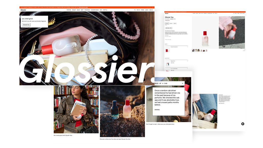
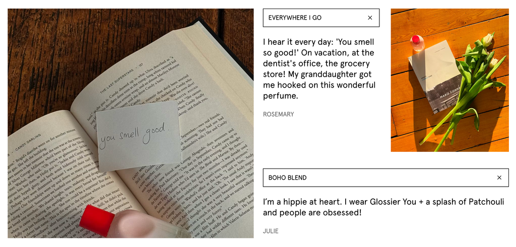
To make up for the lack of sensory experience, Glossier leans into community storytelling: real stories from its users, memories tied to a fragrance, everyday moments and contexts of use. The scent experience is rebuilt through narrative. Glossier doesn’t sell smell. It sells the memories attached to it, in the form of intimate confessions.
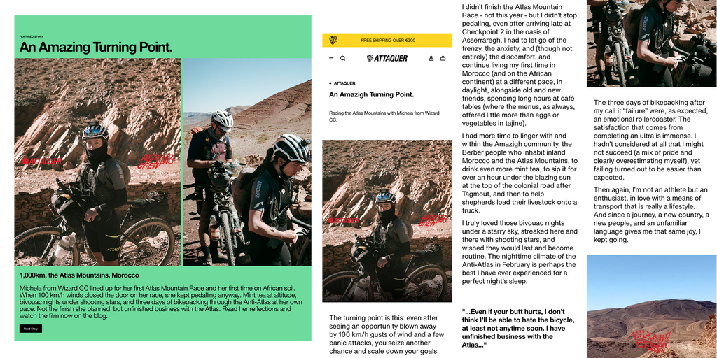
“Michela, from the Wizard Cycling Crew, lined up at the Atlas Mountain Race. At 100 km/h winds, the race was effectively closed to her. She kept pedalling anyway. Mint tea at altitude, nights spent bivouacking under shooting stars, three days of bikepacking through the Anti-Atlas at her own pace…”
This text sits at the heart of Attaquer’s e-shop, set against a vivid mint-green background and a desaturated image. The product, a cycling jersey, appears in the frame, worn, lived in. It is never mentioned in the copy. The writing is narrative, sensory, subjective. Closer to travel literature than to traditional sportswear communication.
This is branding built on the culture of effort, not performance. Attaquer (the name itself says it) doesn’t promise victory, it promises commitment.
If Attaquer weaves failure into its storytelling, SOAR turns it into a campaign.
DNF stands for Did Not Finish. It’s the acronym every distance runner dreads. SOAR built an entire film around it, hosted directly within its online store and prominently featured in the navigation. The setup resembles an anonymous support group.
“Welcome to DNF Anonymous. There’s a chair if you want it. We don’t go into everything. There’s water at the back.”
The tone is restrained, almost clinical. The ambiguity of the term is deliberate. One by one, people speak about the races they never finished, or perhaps about the fact that they never really stopped running at all. The angle couldn’t be further from what Nike would have produced.
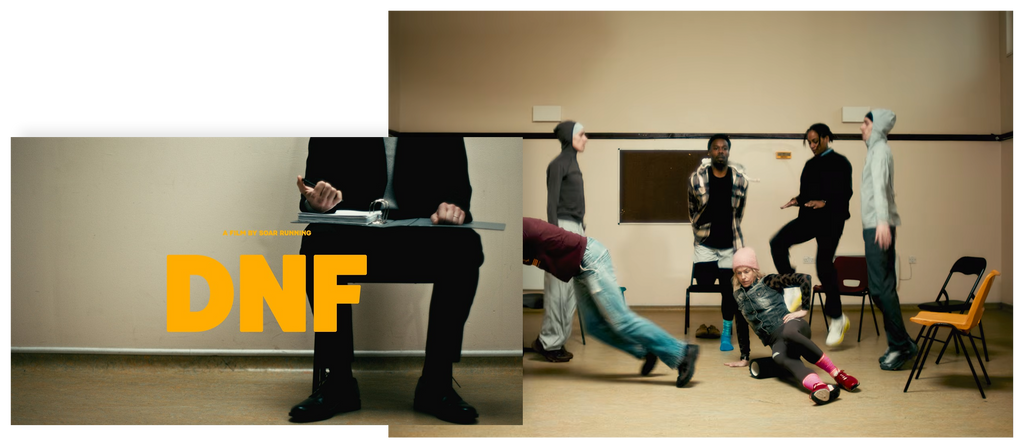
The photography follows the same logic: no glorification of the runners. Images that feel almost amateur, ordinary people caught in motion, faces often hidden in shadow, movements blurred, nothing polished to perfection. And it’s so much better for it.
SOAR doesn’t sell performance. It sells permission to remain yourself, with the promise that its clothing will be there either way.
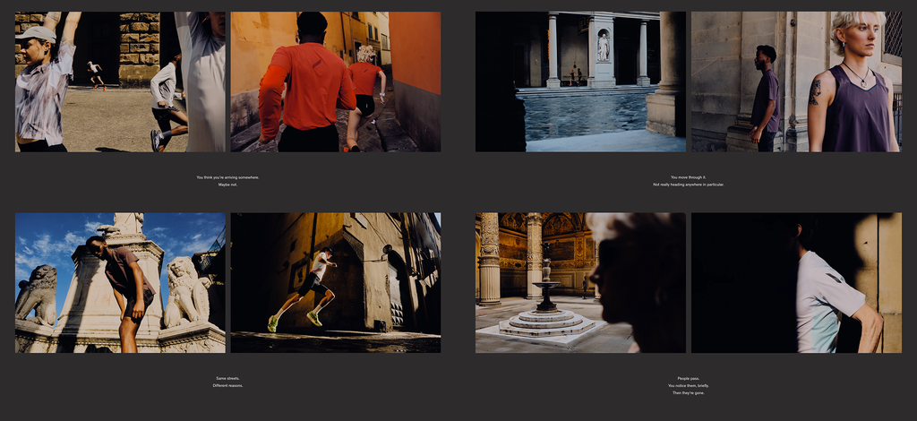
Bandit is a running brand born in Brooklyn, deeply rooted in urban culture. Even its name is a statement: the one who runs outside the rules.
Its product pages feature seamlessly integrated videos, something surprisingly rare in e-commerce.
Throughout the site, the art direction plays with scale: vast landscapes, tiny silhouettes. The runner is constantly reminded of just how expansive their playground really is. The contrast evokes freedom rather than insignificance.
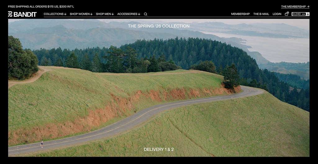
And then there’s the detail that makes you smile. As you scroll down the page, a counter quietly ticks upward: xx kilometres scrolled, complete with a “Keep Scrolling” leaderboard tracking the distance you’ve covered on the site. A trivial navigation interaction transformed into a running metaphor. A very particular kind of running, too. One that would probably make the most competitive athletes break out in hives. Never mind the destination. Forget the time. What matters is that you keep running.
This one is an easy pick, precisely because it’s excessive. And therefore impossible to imitate.
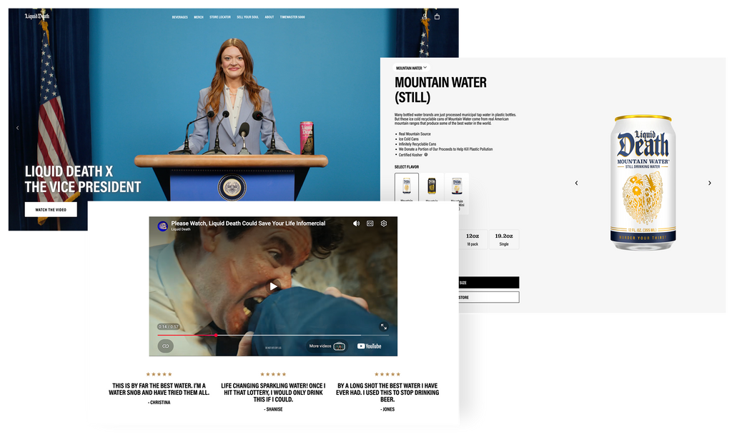
Liquid Death started with a simple idea: canned water. A dripping skull. The slogan “Murder Your Thirst.” A $1.4 billion valuation. Nothing about this story should make sense.
Liquid Death took the most ordinary product in the world and wrapped it in the most improbable branding imaginable. Is it gratuitous provocation, or a rebellion against the tired conventions of the bottled water industry? Gone are the alpine landscapes, the faux-serene dormant volcano and the spiritually awakened soul.
For Liquid Death, existing outside the boundaries of convention means embracing self-parody and unapologetic absurdity. Every visual, every video leans into the ridiculous with remarkable consistency.
What all these brands share is a decision: to reject the conventions of their category and rally their audience around a culture, or a counterculture.
Aesop doesn’t speak like a skincare brand. Bandit doesn’t speak like a running brand. Liquid Death doesn’t speak like a beverage brand.
And in every case, the online store isn’t the place where that stance fades away in the name of ‘not hurting conversion.” It’s where it expresses itself most unapologetically.
If today’s economy demands that brands own their e-commerce, the battle for attention and desire demands that they put something of their own into it. Because desire always starts with a point of view.