
Brand Archetypes: the How-to guide
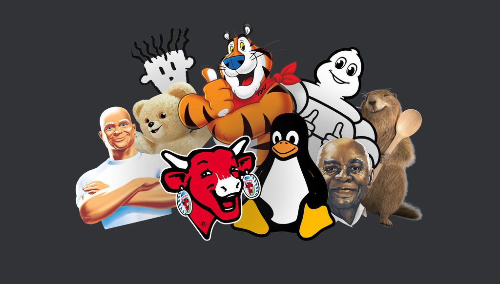
Do you remember them? Fido Dido, Bibendum, Mr Clean, Uncle Ben… the characters we loved, or loved to hate. They defined advertising’s golden age in the 90s. And then, one by one, they disappeared, sometimes quietly, sometimes with a bang.
And now they’re back.
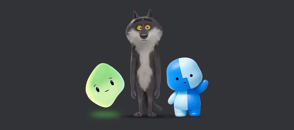
A misunderstood wolf (Intermarché). A shape-shifting blob (Microsoft). A small Finder icon making its way across social media (Mac). Within just a few months, radically different brands have made the same move: creating characters to embody who they are.
Why? And why now? Let’s unpack it.
Mascots are nothing new. Michelin’s Bibendum dates back to 1898. The Caisse d’Épargne squirrel appeared in 1947. Mr Clean arrived in 1972. Each of them solved the same fundamental challenge: making something intangible feel real, and building trust with a commercial entity.
In the 90s, the phenomenon exploded. The Orangina bottle men, Mr Malabar, Kellogg’s Tony the Tiger, Cajoline… mascots took over packaging, TV ads, and playground conversations. The Milka marmot, the one that “puts the chocolate into the foil”, has entered everyday language.
At the same time, the early digital world followed a similar instinct.
Legend has it that Linus Torvalds, the creator of Linux, was once bitten by a penguin, and so Tux was born in 1996. Shortly after, Microsoft introduced Clippy (1997), the wide-eyed paperclip assistant and arguably the first virtual character ever created, already embodying the tension between help and intrusion.
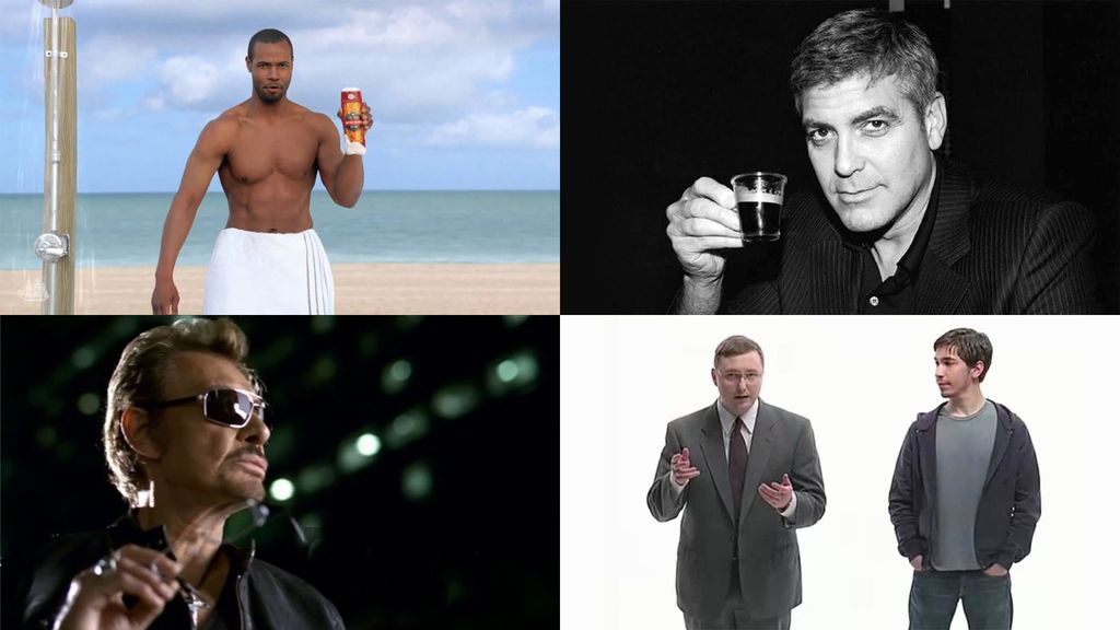
In the 2000s, brands moved away from fictional characters and leaned into celebrities instead. George Clooney for Nespresso, supermodels for fashion brands, Michelin-star chefs for ready meals. The logic was simple: celebrities bring credibility, visibility, aspiration.
Apple took a different route with its “Get a Mac” campaign (2006–2009). Justin Long played the laid-back Mac, while John Hodgman embodied the stiff PC. Sixty-six ads later, Apple recorded a 39% sales increase in a single year, and the campaign was named ad of the decade by Adweek.
Old Spice, on its side, turned Isaiah Mustafa into an absurdly charismatic icon through a series of almost impossible-to-shoot commercials. Even if few people remember his name, everyone remembers the “Old Spice guy”.
Meanwhile, brand design was undergoing a different shift: minimalism taken to its extreme.
Blanding set in: clean logos, neutral typography, interchangeable colour palettes. Brands wanted to feel modern, premium, universal.
Mascots were seen as childish, outdated. Microsoft killed Clippy in 2007. Nobody really mourned him.
And then, something shifted again.
In 2023, McDonald’s brought back Grimace, its purple 70’s mascot, for a quiet anniversary campaign. The #grimaceshake exploded to 3 billion views on TikTok, organically, and without being orchestrated by the brand. The result: +11.7% in revenue.
In 2025, Duolingo announced the “death” of its owl Duo on X. Sixty million views in a matter of hours. During the Super Bowl, the brand captured 84% of online conversation without buying a single ad slot. The stunt ended with a dramatic resurrection in Paris, in front of the Grande Halle de la Villette.
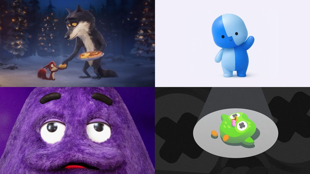
Intermarché released a short animated film featuring a vegetarian wolf learning to cook in order to overcome loneliness. Over a billion views worldwide. The wolf is now officially part of the brand, with plush toys planned for Christmas 2026.
And Apple,the ultimate minimalism brand, introduced “Lil Finder Guy”, a small character inspired by the Finder icon, to promote the MacBook Neo on TikTok. It quickly spread across social platforms, with users already asking for merchandise.
This return is not nostalgic. It’s strategic. Three forces are driving it.
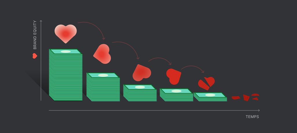
First, a backlash against blanding. When everything looks the same, a character becomes a powerful differentiator, recognisable without even needing a logo.
Second, a social platforms demand embodiment. In a world of shrinking attention spans, brands need to trigger emotion instantly. A character that jokes, reacts, and expresses emotion is far more effective than a static identity.
Third, AI accelerates the need for humanisation. Concerns around the companies behind the technology, data usage, ethics, and environmental impact all contribute to a growing sense of abstraction. Mascots offer something reassuring: a face, a personality, a presence.
The more abstract interfaces become, the more we crave something, or someone, to relate to. Microsoft’s Mico, the spiritual successor to Clippy, embodies that shift: soft, adaptive, expressive, changing colour depending on mood and remembering you over time.
Of course we do. But not just anyone can have a mascot and not in any way.
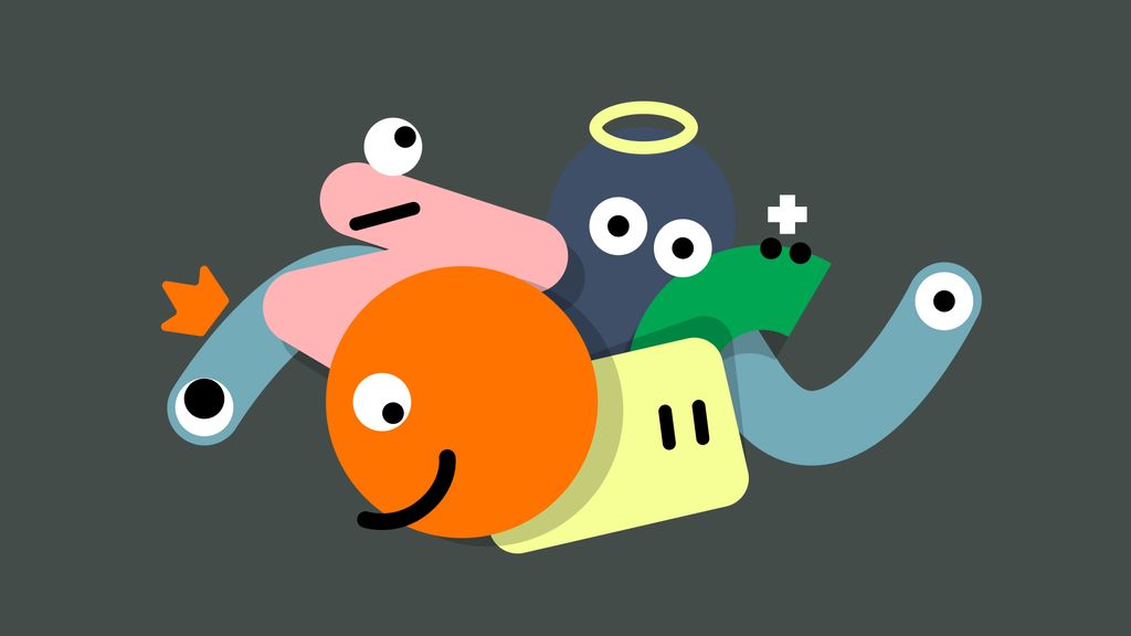
Mascots are not decorative elements. They are strategic constructs. They emerge from a clear foundation: the values they embody, the mission they serve, the story they tell. They are built on archetypes that define personality, tone, and behaviour.
And they are not reserved for any specific industry. Whether in banking (Elantis), telecom (Orange), public institutions (Province of Liège), or healthcare (Focus), mascots can play a meaningful role.
From Mr Malabar to Intermarché’s wolf, from Bibendum to Mico, the embodied character remains one of the most powerful tools in branding. Because at its core, it solves a problem as old as commerce itself: How do you build trust with a brand?
The question is no longer whether a brand should have a mascot. It’s what story it wants that mascot to tell.