

- Author
- Wenzhu Wei
- Date
- 19.11.2026
- Reading time
- 7 min
- Categories
- Branding
Dynamic Branding
The most recognizable brands change the most.
Before it became a profession, branding was “a burn”.
The word comes from Old English brand: a burning ember, a fire. Ranchers seared livestock with a hot iron to show ownership, and in a grim chapter, so were slaves and convicts. The mark had to last a lifetime and read at a glance.
Marketing kept the term and the idea that a brand never changes.
Yet the brands we recognize best today are often those that are constantly changing. That is the very paradox of dynamic branding. And it is less contradictory than it seems. To understand how this works, we need to go back to the basics of what a brand is.
A brand is everything that makes it recognisable
In French, we often translate branding as ‘visual identity’. Handy, but too narrow.
Branding is everything that makes something recognisable: a name, a color, a typeface, a tone, a sound, a way of responding to a customer. Netflix’s ‘ta-da’ is branding. So is the red on a Coca-Cola can. The way customer service speaks to you informally is part of it, too.
Still, let’s be real: in today’s communication world, we spot a brand mainly with our eyes. On a website, we scan, decide in a split second, and remember what we spotted at first glance.
Bottom line: a brand needs consistency.
Without stable reference points, there is simply nothing to recognize.
The ‘red-hot iron’ had at least got that right.
“Just a logo” is no longer enough
Dynamic branding is nothing new. Designer and Johnson Banks founder Michael Johnson traces its roots to the 1970s, when American broadcaster WGBH flexed a fluid identity. Yet many of us have never heard of the term….and when clients brief us, the first line is almost always “We need a (new) logo.”
Back in art school we lived for print, but the web and later apps kept smashing our assumptions about communication.
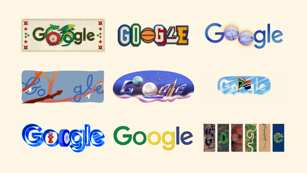
In fact, I don’t know about you, but I was fascinated by Google’s first Doodles. The logo would transform into a game, an illustration or an animation. The letters morphing an ‘o’ into a planet, an ‘l’ into a character kept the brand alive. You always knew you were on Google, often before you’d even read the word.
The Google logo consists solely of simple letters and four primary colors. It’s recognizable by the order of those colors, a sequence found in no other brand. The Doodles use these cues to play with everything else, turning the logo into a game and making the public eager for the next one.
The more Google mixes up its logo, the more people love it. Variation doesn’t dilute the brand; it forges an emotional bond between the person and the brand.
Today, businesses can no longer avoid the issue, for four reasons:
1. Competition is intensifying
Your audience needs to spot your brand fast. In a crowded market, consistency alone won’t cut it. People have to recognize you everywhere, in any format, in half a second.
2. Channels keep multiplying
Once upon a time, a shop sign did the talking. Then came print: leaflets, vehicle wraps, trade-show booths.
Today the same brand must shine on a 16-pixel icon, a vertical story, a watch face, a ten-meter banner, and a push notification. Design it for one format and it will get distorted, cropped, or illegible somewhere.
3. Industries are diversifying
Remember, Nintendo began in 1889 making playing cards. Netflix used to mail DVDs. Michelin still tells you where to eat and which tires to roll there.
Our clients are doing the same on their own scale. They launch new products, enter new markets, target new audiences, and they can’t afford to redraw their brand each time.
Their business moves fast, and their brand must move with it.
4. Structures are becoming more complex
Take Institut Notre-Dame d’Heusy (project under development), a school group with nursery, primary, and secondary branches. Values stay the same, but you don’t talk to nursery parents the same way you talk to teens picking subjects. Different expectations, different worries.
To meet this challenge, we took a two-stage approach:
- First, we nailed consistency. We locked down the elements that never change: bold symbols and typography. We built the logo from three letters and a star, all locked in a square. One compact, assertive mark that cuts through the sea of generic school logos.
- Next, we explored variations. Building on this solid foundation, we developed variations across three areas: colors, symbols and layout grids. Each section finds its own voice to speak to the parents it serves, whilst remaining true to Notre-Dame d’Heusy.
Second takeaway: a brand also needs variation.
Our clients’ dynamic reality demands that flexibility.
Consistency on one hand, variation on the other. The trick is making both work together.
A dog is still a dog
How can something change its appearance without changing its identity? We do it every day without even thinking about it.
A Chihuahua and a St Bernard have almost nothing in common; they are not the same size, nor do they have the same color or the same bark. Yet a three-year-old will tell you, without blinking, that they’re both dogs. Hr would most likely say the same even if you were to draw him a god with five quick lines on a napkin.
Céline slides into the office in a black suit. Later she hits the town in a fuchsia sequined dress. No one bats an eye : it’s definitely the same girl. We ID her by her features, her voice, the way she laughs, the vibe she gives off.
AI learns the same way. To teach an AI to spot a dog, we show it thousands of images: big dogs, tiny dogs, spotted dogs, blurry dogs, pixelated dogs, head-on and from behind. Slowly it grasps two truths: the one thing that never changes and how much everything else can swing.
Our brain does the same with brands. It doesn’t memorise a static image; it memorises constants and a range of variation. With every new, consistent variation, we remember the brand a little better.
That’s the whole point. A strong identity is an actual personality we can spot. I’d even say it’s a personality we can feel, even before we spot it.
Design rules rather than symbols.
A dynamic system is not a logo that is randomly distorted. It is a grammar of fixed rules and changing words.
An identity is made up of several building blocks: the logo, typography, color, grid, graphic elements, imagery, movement, sound and tone. Designer Irene van Nes puts it plainly in *Dynamic Identities*: fix one or two blocks, then set the rest free.
The main system types are:
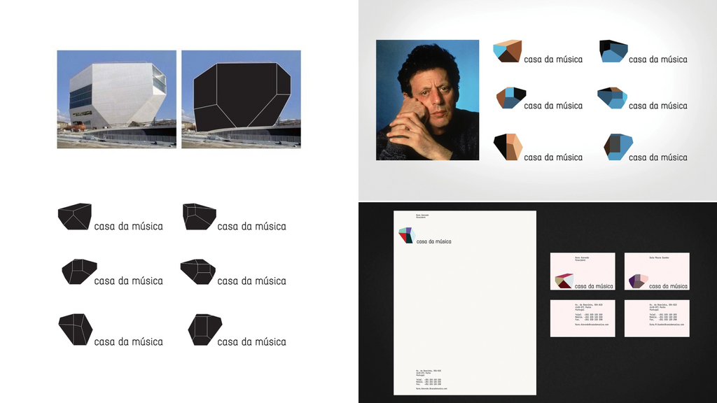
- The container. You keep a fixed form and change what it contains. The Casa da Música in Porto (2007), designed by Sagmeister (2007), retained the building’s silhouette and gave it the colors of each event.
- The formula. Rules stay fixed, design doesn’t. Think Google Doodles.
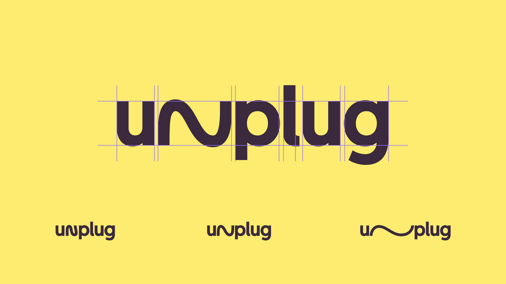
- Responsive design. The logo adapts to the available space. The ‘W’ for the Whitney Museum (2013) by Experimental Jetset stretches or contracts depending on the format.
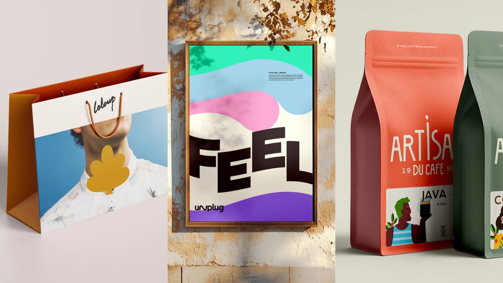
We used the same trick for the Unplug logo, a multi-leisure spot that’s all about fun and unwinding. - Generative design. An algorithm where data shapes the brand. The MIT Media Lab (2011) generated a different logo for each of its members. The Norwegian region of Nordkyn varies its logo according to real-time weather conditions.
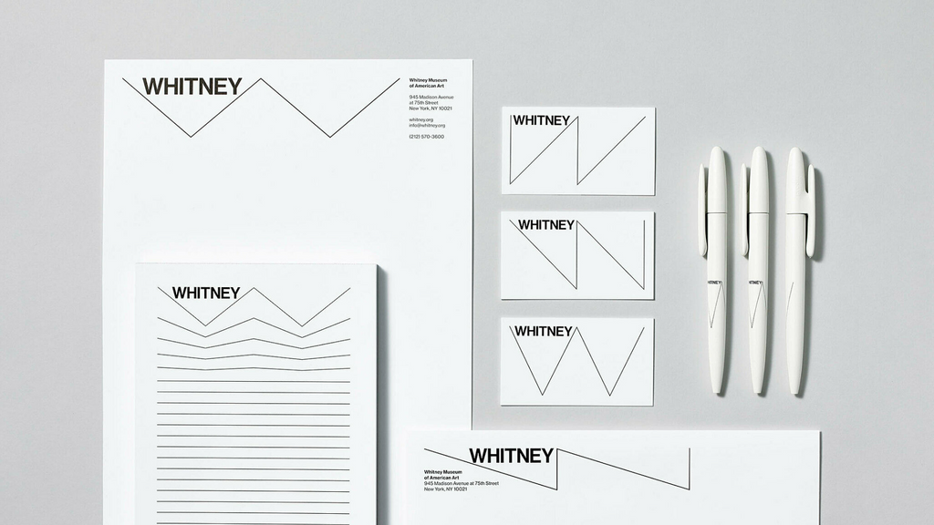
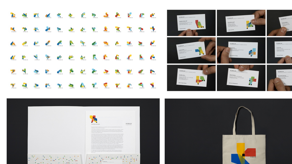
The benefits go beyond aesthetics. A well-designed system becomes a tool. Your teams can produce a poster, a post or a presentation themselves without having to go through the agency every time and without compromising the brand.
When the dog starts meowing
A dog may be big or small, ginger or black.
But the day it meows, serious questions arise about its identity.
This is a pitfall of dynamic branding. Poorly managed flexibility does not create value; it induces confusion. Three rules to avoid this:
1. No variation without a core
The more blocks you free up, the stronger the ones you lock down must be. As Logic Design puts it: ‘It is iconicity that enables flexibility.’ Google can play with its logo because we spot its letters and colors in an instant.
2. No variation without a reason
“Just because you can, doesn’t mean you should,” as designer Greg Quinton pointed out in Design Week. Just because you can vary a brand doesn’t mean you should. A bank or a hospital doesn’t have the same leeway as a music app. Every variation must serve a purpose: a target audience, a medium, or a service offering.
3. No variation without governance
A system without guidelines won’t last long. Who decides on a new variation? Using which templates? Within what limits? Back in 2013, Eye magazine fretted about systems pushed “to breaking point,” systems that fall apart the minute non-designers touch them.
With generative AI, you need those answers before the first prompt. AI can spit out endless brand variations in seconds, but only if you feed it clear rules. Think of the graphic system as a config file: the crisper it is, the truer the brand stays, even in stranger hands.
What’s the takeaway?
At EPIC, clients walk in needing a logo. We build it into a full system, and if the project demands it, we make that system dynamic. Whatever they come looking for and whatever they take away, the most important thing for us is that they’re proud to show off the result. So far, we’ve risen to that challenge every single time!
Our designers wear two hats. First, as graphic designers, they craft a symbol: an image that represents your business and tells your story. Second, as art directors, they build a system: a language that links the logo, media, tone, and audiences, forging a consistent emotional connection wherever the brand shows up.
A system demands more work than a logo, so we stick with your team through the rollout, long after the PDF lands, until everyone owns it.
Ready to roll? Start by asking yourself these questions:
- What is it about your brand that must never change?
- Across how many media channels and formats does your brand currently exist? And in the future?
- Do you serve multiple audiences, product lines, or business units?
- Is your brand already recognizable enough to allow for variation?
- Who will craft future variations, and with which tools?
(And… if your brand were a person, would you recognize it in evening dress?)
If you hesitated over more than two answers, let’s chat.