
- Author
- Karim Maaloul
- Date
- 26.07.2026
- Reading time
- 6 min
- Categories
- Trends
- Branding
Cuteness takes over our screens
Japan is the land of wabi-sabi, Zen, and carefully raked gravel gardens. It is a country of handle-free, unadorned, silent interiors.
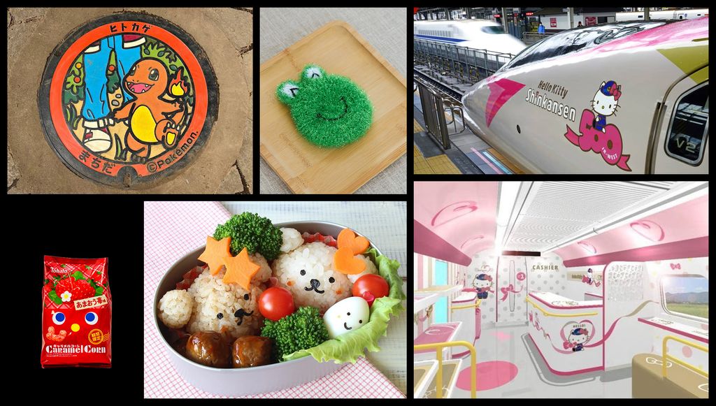
Yet Japan also adds eyes to its recycling bins, coffee machines, crisp packets and car park entrances.
Design swings from rigorous minimalism to emotional excess. Serene spaces invite introspection, while everyday objects beg for connection.
That urge to connect is what we’re exploring today. How is design evolving toward maximalism and anthropomorphism to forge a bond with us?
But what is the purpose of design?
For years, and even today, we’ve been asked what design is for. The obvious answer we repeat without even thinking is: ‘To solve problems’, ‘To eliminate friction’, or ‘To make things usable that weren’t before’…
We nod in automatic agreement. Flat design, minimalist interfaces, and smooth, flat, textureless objects have had their moment. A standard that values simplicity and clarity, because nothing should get in the way of functionality.
Push it too far and emotion vanishes.
Lifestyle
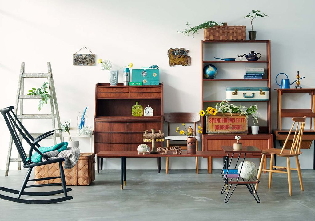
Once again, a breath of fresh air comes to us from Japan. Kenya Hara, creative director at Muji, offers a different perspective. He says design doesn’t solve problems. It creates contexts of life.
It’s the atmosphere you sense when you step into a dojo, unwrap a present, sit on a Japanese toilet, or give a book pride of place on the shelf.
Irrational and impossible to measure in an A/B test, it’s why we keep some objects for twenty years and toss others after six months.
Real-life example: Cotta
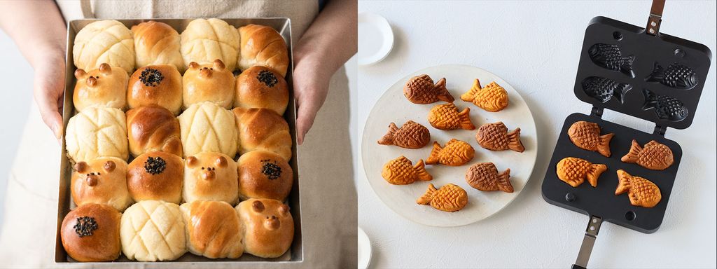
Take Cotta, for example, a company that sells supplies for amateur bakers: animal-shaped moulds, packaging and decorating equipment. A manufacturer of industrial desiccants launched it in 1998.
A manufacturer of industrial desiccants! A desiccant is a drying agent used to control humidity. In terms of appeal, it doesn’t get much worse than that.
Seiichi Sato reckoned that by creating cute products, he’d reach a different, more mainstream audience. Genius or just common sense? Either way, it was a massive hit.
Thanks to Seiichi, people who’d never taken cooking seriously have discovered that their greatest passion in life is making cat-shaped macarons. During the Covid-driven craft boom, Cotta’s profits hit $81 million.
Cuteness may not solve a practical problem, but it certainly connects people to a brand.
The other country of design
Let’s travel to Sweden, the land of Ikea and Volvo, pragmatism and simplicity.
Yet the pendulum swings the other way too, delivering maximalism and emotion.
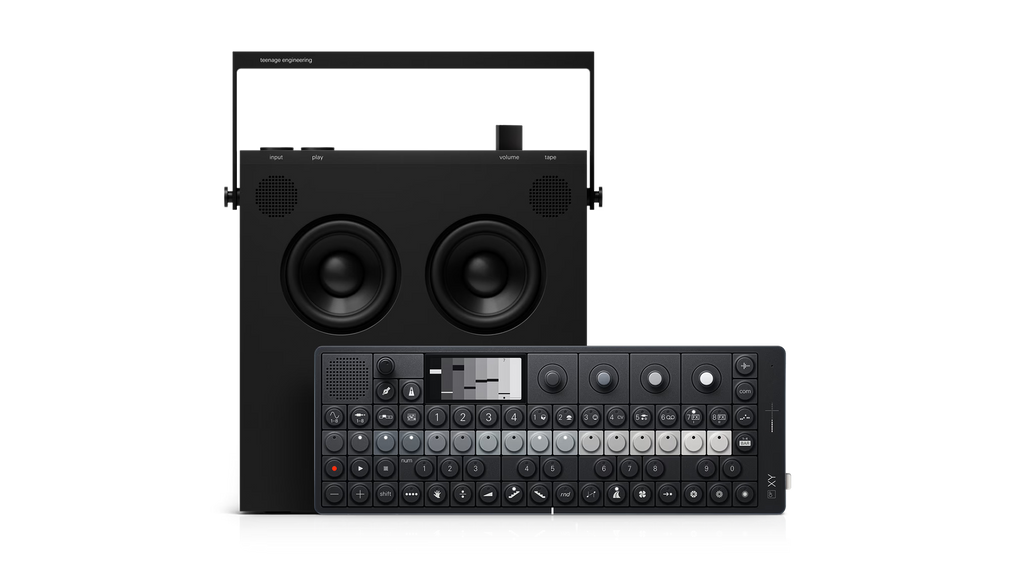
Teenage Engineering, founded in Sweden in 2005, makes musical instruments, speakers and portable mixing desks. Their gear has buttons – loads of them. Rotary encoders, tiny dot-matrix displays, rubber keys bursting with color, shape and texture.
The vibe sits somewhere between a Russian Geiger counter and a Fisher-Price toy phone on wheels, minus the Soviet austerity and the toddler-friendly naivety.
Just have a look.
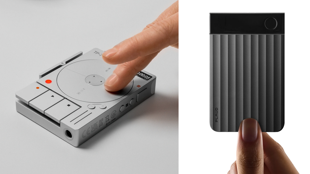
They also sell a portable recorder with a spinning disc and tactile buttons that you just can’t resist pressing, just to hear the sound it makes.
In the meantime, their competitors strip their products of any flair, turning them into yet another power bank looking product.
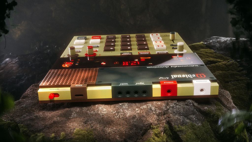
Think they can’t get any more flamboyant without crossing the line into bad taste? Meet Medieval, a synthesizer that revels in spectacular visual excess, right down to the typography of its illuminated displays.
And what about mechanical keyboards, then…
Teenage Engineering realised that technology is an incredibly powerful tool. They recognised that beneath every rational mind, there is a beating heart.
Thanks to Hugues, EPIC’s IT infrastructure runs almost entirely on Apple gear.
Hugues is my business partner at EPIC; he’s the technical director and manages the IT infrastructure. He’s also a die-hard fan of Apple products, as much for their impeccable design as for their fail-safe technology.
And yet…
What Hugues values more than the immaculate chrome finish of his MacBook Pro is his collection of mechanical keyboards.
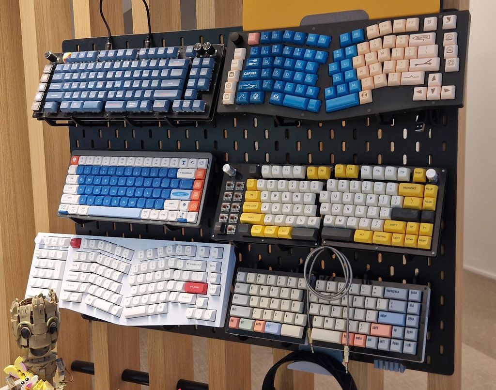
He loves the soft click the keys make beneath his delicate fingers. Just as much as the tactile feedback that sends a thrill through his very soul when the key snaps back into place.
He loves the little LEDs that welcomes him with a friendly glow. And the case design that whisks him away to a utopia where SSL certificates never expire.
The mechanical keyboard market is set to reach $1.3 billion by 2025.
The thing is, as well as the satisfying sensation of popping bubble wrap with every keystroke, everyone personalizes their keyboard with their own set of keycaps, colorful, illustrated and customized. The object becomes unique and the sense of ownership is multiplied tenfold.
It’s the grown-up toy you can actually talk about at the coffee machine.
Screens too
This return to expressiveness isn’t limited to physical objects. It’s on our screens too.
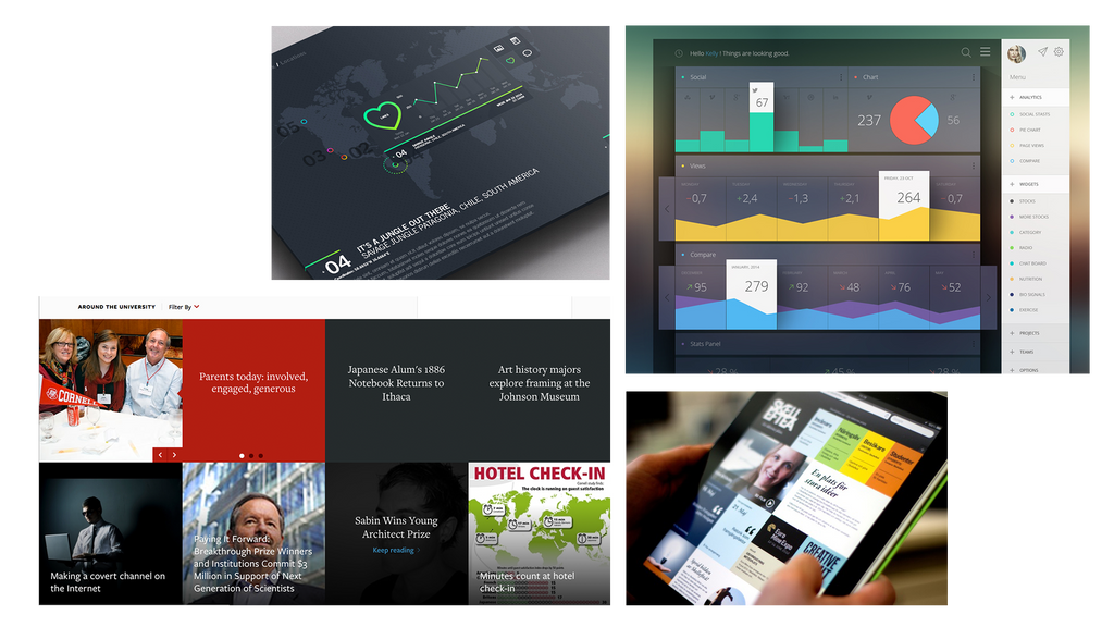
Interfaces are going kawaii. Rounded corners. Pastel color schemes. Big-eyed characters. Ultra-smooth, plump hands glide across onboarding screens showing you how to swipe.
You’ll spot it on insurance sites, and tax apps.
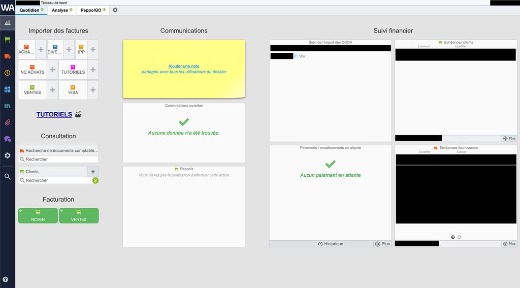
Normally, an accounting app looks like this. I promise you, this is what my accountant makes me use to send my invoices!
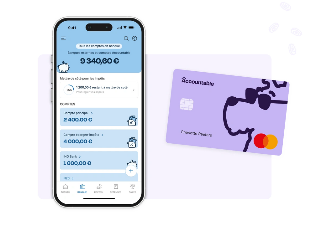
Then there’s Accountable. It does the same thing. An app that handles VAT, tax returns and social security contributions. Look at those rounded corners, soothing colors and illustrations that seem to say, ‘Don’t worry, we’ll get through this bloody tax return together, I promise!’.
The most anxiety-inducing task you could possibly entrust to a screen has been redesigned using the visual language of a meditation app.
Emojis
When your illustrator’s unavailable, your OS steps in.
Emojis now rule Notion, Airtable and our quarterly balance-sheet spreadsheets. We drop a rocket 🚀 next to a financial target 💸. We slap a skull 💀 on an overdue task ⏳. In proper companies 🏢. With real budgets. 👨🏻💼 CEOs, 👩💼 CFOs, and all the other 👽 👹 🐱 C-level executives around the table.
The trickier the issue, the cuter the character we come up with. The trick isn’t to sell; it’s to reassure, provoke a reaction, say what we dare not voice. Strangely, it works for everyone. Your eye darts to the emoji that tells you what to think of line 64 on the ‘recurring costs’ tab.
Let’s talk trajectory.
Because “cute” doesn’t always mean the same thing.
Hello Kitty. Oval face, round eyes, no mouth. That blank space lets you project your own feelings. She’s sad when you’re sad. Happy when you’re happy. She’s a universal vessel for feelings, endlessly adaptable for pencil cases, T-shirts, toasters, even limited-edition Fender Stratocasters.
But this sort of ‘cute’ is everywhere now. When the clichés run dry, we crave depth and a fresh perspective.
In 2019, *The Mandalorian* hit Disney+. Grogu, aka Baby Yoda, turned up with big green eyes, a tiny frame, floppy ears and a lost expression.
A far cry from the usual aesthetic norms.
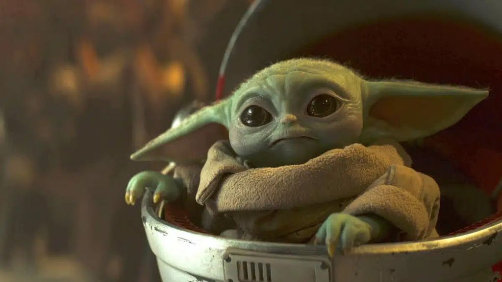
These proportions trigger our protective instincts. The same signals as an infant, a puppy, or any vulnerable creature. The brain releases dopamine. We love it.
Long before that, we had E.T. and his distinctive appearance. But his fragility and his unbreakable bond with Elliott, his saviour, make him infinitely endearing.
Today we have Labubu.
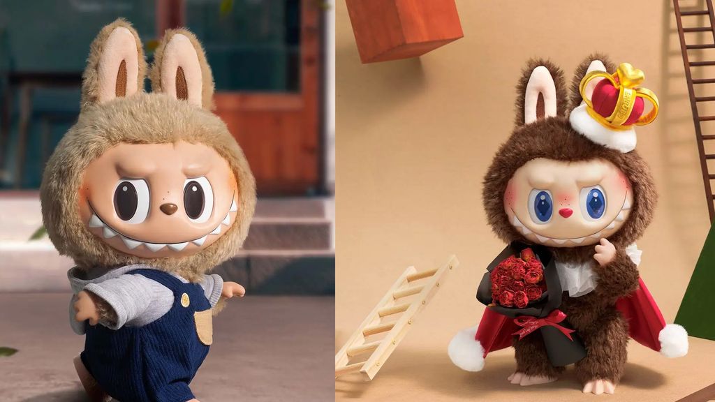
Labubu burst onto the scene in 2015. She vaguely resembles a rabbit, with small teeth and a smile that hovers somewhere between “I might just bite you” and “I’m completely mentally unstable”.
In 2023 and 2024, Labubu went viral. Queues formed outside shops in Paris, London and Seoul. Fake ‘lafufu’ merchandise hit the market, clear proof of her success.
From Hello Kitty to Labubu, ‘cute’ now means something else. Hello Kitty is harmless. Baby Yoda is vulnerable. Labubu is, to say the least, unsettling. That’s the niche she’s carved out for herself. When everyone’s chasing ‘cute’, simply being ‘cute’ isn’t enough. There has to be a slight edge.
Just cute enough to charm, just strange enough to stand out.
What this means for brands
What Japan has long understood is that the two approaches are not mutually exclusive. A Zen garden and a recycling bin with eyes can coexist on the same street because they fulfil different needs. One soothes. The other engages. In both cases, we’re talking about emotion.
Brands are moving away from the 4Ps (Product, Price, Place, Promotion) in favor of what luxury guru Daniel Langer calls the 4Es: Experience, Exclusivity, Engagement, Emotion.
Personality is no longer a perk reserved for established names. It’s the bare minimum. Blandness is a dead end.
A product with a voice stands the test of time. A page that grabs your attention sees lower bounce rates. A brand that tugs at our heartstrings is a brand we share with friends.
Will brands beyond soft-toy makers dare to embrace the gritty-cute (or ugly-cute) aesthetic in the years ahead? All signs point to yes. Watch this space.